work /
Vetty
A Consumer Reporting Agency for the future of work.
Primary UX - Winter 2018 to Summer 2019
Scott Liang - UX research, UX design, product design, visual design, strategy
Mike Cerrone - strategy
B. John - engineering management (offshore dev team)
From Winter 2018 to Summer 2019, I was tapped by Vetty, a Consumer Reporting Agency (CRA), to design their entire platform from scratch. At the most basic level, CRAs conduct background checks on potential employees. They represent a $3.2B market that's experiencing rapid change due to the rise of the gig economy. Some recognizable brands include:

In practice, a CRA is a collection of 3 separate products (for 3 separate demographics) that interact tightly with one another:

This means that, for any check to be considered complete, 3 different people must finish their workflows in a specific sequence:

Prior to my arrival, Vetty was in a period of stagnation. They had no products of their own (rather, they rented an antiquated third-party CRA platform) and struggled mightily to attract and retain customers.
They needed my assistance to accomplish three things:
The following are the steps of the design process that I conducted with Vetty. Since speed was prioritized and customers were willing to "guinea pig" the live product, we skipped a few validation phases.

We phased the releases according to priority, first focusing on shipping + iterating the outward-facing products (the researcher portal, being an internal product, could remain on the rented platform for the time being). Once the client and candidate portals could sufficiently attract and retain customers, we added the new researcher portal to the roadmap.

Key challenges I faced when creating Vetty:
Due to the scope of the project, establishing visual standards early was necessary. The branding is trustworthy and professional while remaining approachable (through the use of rounded divs, drop-shadows, gradients, and modern line-icons). Colors are used functionally to assist users with understanding tasks.

I also created a few character illustrations for use in marketing material:

Understanding the needs and experiences of Vetty's customers was priority #1, so I made sure to keep a steady stream of qualitative research both pre- and post-launch.

The following is a journey map developed from a talk-aloud with an account manager (the user who spends the most time on the product):

Vetty's users didn't conduct background checks because they enjoyed it; they conducted them because they had to. The less time and energy they spent in Vetty, the better. Some particularly frustrating experiences they faced:
These insights led to the following product principles:
The client portal is organized around "packages," a top-level configuration of checks that one can "set and forget." This way, admins configure the packages once during on-boarding, and then account managers simply select the appropriate package for a given worker (no need to think about it).

This is the account manager's most simple workflow:

The dashboard is home base for account managers. Statuses are styled to be the loudest elements on the page, as they are meant to inform users which tasks to perform next. They can also be filtered through a set of dedicated controls.

Hitting "New Candidate" (the "+" button) brings up this modal:

Most of the account manager's tasks are performed here.

A few callouts:
Examples of statuses, action boxes, and modals:

Action boxes and modals allowed us to condense complex workflows into very simple "wizards" for users to follow. In the above pre-adverse action workflow, regional legal requirements are handled and email values are automatically generated.
The unique link feature was one of our most well-received iterations. In the account manager's original workflow, he was tasked with both a) keeping track of each candidate and b) manually entering their preliminary information. Over time, this proved to be unwieldy due to the volume of gig workers they handled.
Fortunately, we found that most workers had a supervisor (or "candidate representative"); e.g. the owner of a small painting company who hired painters off the street. Such reps could easily keep track of their workers and were happy to distribute links to them.
This allowed us to created a unique link feature, which offloaded some of the account manager's work onto the reps and candidates.

Creating a new unique link:

Clicking on the link brings candidates to this special welcome page:

Once their applications have been completed, candidates appear in the dashboard for approval:

Here, the candidate's details are set up and the checks are waiting for approval:

As a bonus, the unique link can also be used in kiosks or custom landing pages to expedite the hiring process.
Overall, the new client portal led to numerous desired outcomes:
On to the candidate experience! Due to them being less available and less incentivized, gig workers were much harder to reach for feedback. However, some survey responses yielded a few key points:
Product principles:
A basic candidate workflow:

Catalog of form components:
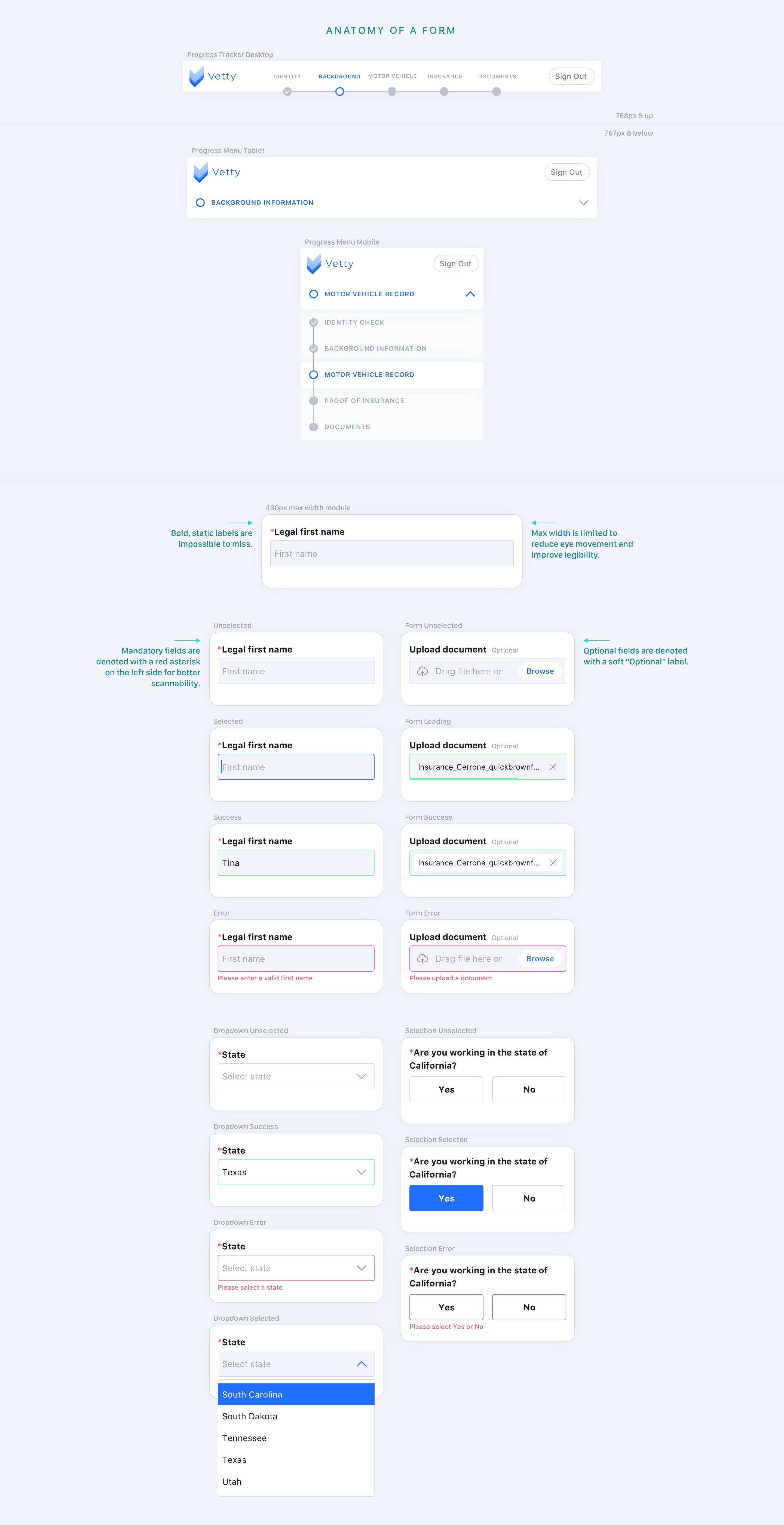
The welcome page—on the right is an example "easy mode" iteration to accommodate low-skilled overseas engineers:

The identity check uses a stylized iframe from the vendor Berbix. Once completed, a payload of data is returned and used to pre-populate fields on the background info page:

The motor vehicle record check is also pre-populated. When manually entered, the number is verified against a database of regionally-specific formats. A "soft" warning is provided if there is a mismatch:

Ah, the land of legalese. This is where many of our disagreements with lawyers arose:

We originally proposed a link-wrapped + consolidated version of some documents so candidates could breeze through them. However, the lawyers strongly recommended that each document be presented on its own page with at least some language visible.

Docs that require a "wet" signature, and then a success page:
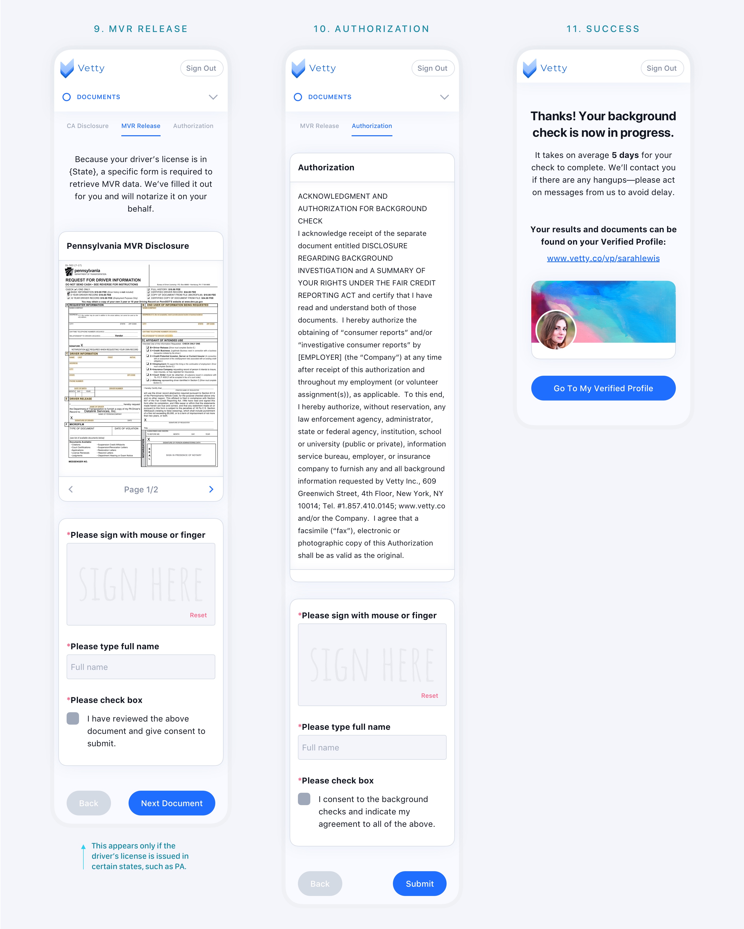
When finished, candidates arrive at their very own Verified Profile, a convenient place for them to access their paperwork and personal information. This was the key element of our "candidate-centric" approach. Whereas other CRAs treat candidates as an afterthought, we felt it was important to treat them as well as their employers.

The Verified Profile helps accomplish a number of tasks more easily, such as disputing erroneous results and handling exceptions (e.g. when the wrong SSN is provided).
If candidates opt-in, a public profile is created. This attaches a unique link to the profile and allows it to be shared or found in search engines. But not to worry—personal information is obscured unless the viewer has been authorized by the candidate. (Public profiles can help clients avoid redundant checks, candidates get hired faster, and Vetty receive more inbound traffic.)

While quantitative outcomes are still unclear, we have already received positive feedback that the candidate experience is "much smoother," that "completion rates are better," and that "customer support questions are fewer."
Lastly, the third leg of the stool: the product that researchers (Vetty employees) use to actually conduct the background checks.
Product principles:
This is a basic researcher workflow. Note that it is divided into 3 stages:
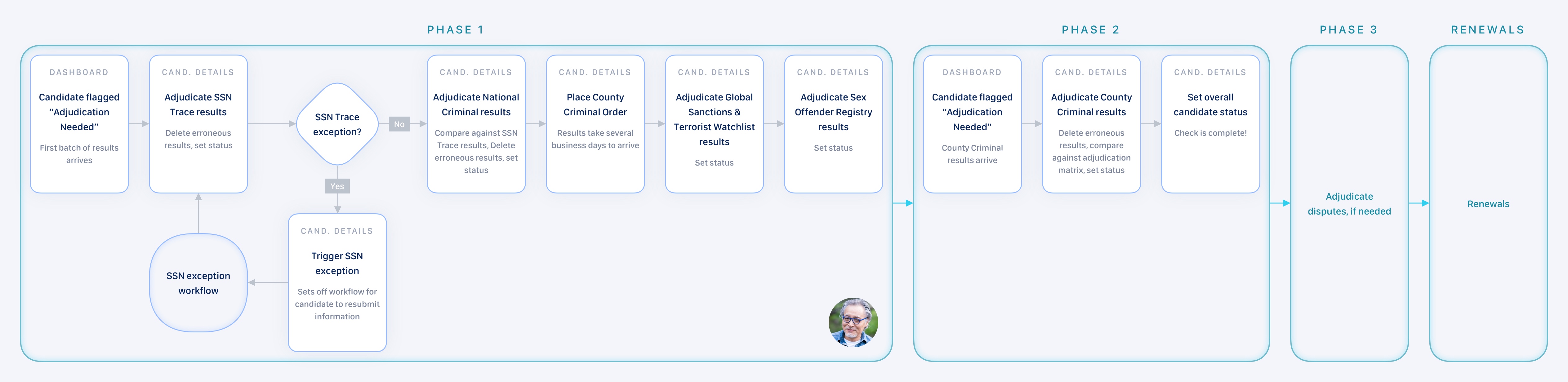
Generally, teams of researchers are assigned to different accounts, with each member taking on a specific phase. Due to Vetty's limited resources, individual researchers take on their own accounts and conduct all 3 phases.

The main focus of the researcher dashboard is the "Adjudication Needed" column, which uses a simple "yes" or "no" to indicate when there is a pending task. Hovering over the cell in the column brings up more detailed information.

Because researchers are trained users, the dashboard can adopt more complexity for more power. Below, custom components that allow each column to be independently searchable:

Much like the client portal (for account managers), the candidate details are where most of the tasks are done:

Key items:
The researcher portal is now undergoing a major redesign to accommodate larger teams. Stay tuned!
Whew, that's it! A complete Consumer Reporting Agency platform from scratch. As of this writing, Vetty has experienced a 10x increase in MRR and is now undergoing a serious M&A bid. If you have any questions, or would like to work together, please don't hesitate to reach out at hello@scottliang.com.
